A historical price of silver graph is much more than just a squiggly line on a screen; it's a visual story of economic booms and busts, global crises, and our ever-changing industrial appetite for the metal. Learning to read this graph isn't about memorizing data points. It’s about understanding the narrative behind every peak and valley, uncovering the powerful forces that shape silver's true value.
Reading the Story of Silver on a Price Graph
At first glance, the up-and-down movements of a silver chart can feel random, almost chaotic. But once you know what to look for, it's like learning a new language. Every single move tells a story about the global economy and what investors are thinking and feeling. The graph is a timeline where you can see the real-time impact of major world events on silver's price.
Think of the graph's two main axes. The vertical line shows the price, usually in U.S. dollars per troy ounce. The horizontal line shows time, whether in days, months, or even decades. When you trace that line from left to right, you are quite literally watching silver's history unfold before your eyes.
Understanding Peaks and Valleys
The most obvious features on any silver chart are its peaks (the high points) and valleys (the low points). These aren't just random fluctuations. They are direct reactions to significant, real-world events.
A sudden, sharp spike upwards might reflect a moment when people lose faith in paper money or when a new technology creates a surge in industrial demand. On the flip side, a steep drop could signal a strengthening economy where investors feel confident taking more risks, or perhaps a massive sell-off after a period of wild speculation.
Look at a chart spanning a few decades, and you can easily pinpoint times of high inflation or geopolitical turmoil where silver’s price shot up. These peaks show its enduring role as a tangible safe haven that people run to when things get uncertain. The valleys? They often line up with periods of economic calm and low inflation, when investor attention shifts to other assets.
By connecting these price swings to historical events, you graduate from simply seeing data to truly understanding market behavior. The graph becomes a powerful tool for spotting patterns driven by human psychology and cold, hard economic facts.
Interpreting Timeframes
The story a chart tells can change dramatically depending on the timeframe you’re looking at. A chart showing the last 24 hours might look incredibly volatile, capturing the day-to-day market noise and short-term trading. But if you zoom out to a chart covering the last 20 years, a very different, much clearer picture emerges.
- Short-Term (Days to Months): These charts are all about immediate price action. They're heavily influenced by breaking news, like a central bank announcement or a surprising economic report.
- Medium-Term (1-5 Years): This view helps you see the broader trends taking shape. You can observe how silver reacts to longer economic cycles, like periods of industrial growth or government stimulus.
- Long-Term (10+ Years): This is the macro view. It smooths out all the short-term noise and reveals silver’s performance across different economic eras and its core, long-term value trend. This is where you can truly appreciate the tangible history represented by something like a 10 oz Silver Bar.
By switching between these views, you get the full story. The short-term volatility is just one small chapter in a much larger, more stable narrative. It’s this perspective that helps you understand why physical silver, from classic 1 oz Silver Rounds to larger bars, has been a cornerstone of wealth for centuries. The graph is your map to that enduring legacy.
What Drives the Price of Silver Up or Down?
To really read the story a historical price of silver graph is telling, you have to look past the line itself and get to know the forces pushing and pulling it. Silver's price is fascinating because it truly lives a double life. On one hand, it's a tangible asset people run to when the economy gets shaky. On the other, it's a critical raw material that powers our modern world.
This split personality creates a constant tension. Its value is tied to global economic growth and new tech, but it often climbs highest when that very same economy looks like it's in trouble. It’s this never-ending tug-of-war between industrial demand and investment demand that carves out the unique peaks and valleys you see on a price chart.
The Industrial Engine
Here’s something that really sets silver apart from gold: a huge chunk of it gets used up by industry every year. In fact, over 50% of all silver mined is consumed in industrial applications. This makes its price incredibly sensitive to manufacturing trends and the overall health of the economy. When factories are humming and economies are growing, the demand for silver naturally goes up.
Just think of it as a key ingredient in our high-tech recipe. Silver is absolutely essential in a ton of growing fields:
- Green Energy: It's a critical component in the photovoltaic cells that make solar panels work. As the world keeps pushing for cleaner energy sources, the demand from this sector just keeps climbing.
- Electronics and 5G: From the smartphone in your pocket to complex circuit boards, silver's conductivity is second to none. The global rollout of 5G technology is another massive driver of industrial silver consumption.
- Medical Applications: Thanks to its natural antimicrobial properties, silver is vital for everything from medical instruments and wound dressings to water purification systems.
This industrial consumption creates a strong price floor for silver. Because so much of this silver is used in tiny amounts inside complex gadgets, it's often not worth the cost to recycle it. That means the supply is constantly being depleted, which provides a solid baseline for its value.
The world's relentless appetite for silver in technology acts as a powerful anchor for its price. While investment demand can cause those wild, headline-grabbing swings, the steady, underlying need for physical silver in manufacturing provides a constant source of demand that shapes its long-term price trend.
The Safe-Haven Shield
While industry provides a demand floor, it’s silver's age-old role as money that creates the dramatic peaks on the graph. For thousands of years, people have seen silver as real money and a reliable store of value. It even earned the nickname "poor man's gold" because it gives you similar safe-haven protection at a much more accessible price.
When investors get nervous about the stability of the financial system, they often flock to physical assets they can actually hold in their hands. This is when you see a surge in demand for products like silver coins and bars. The key triggers for this shift are usually:
- Inflation Fears: When people expect the buying power of currencies like the U.S. dollar to drop, they buy silver to protect their wealth.
- Geopolitical Risk: Global conflicts or political chaos can send shockwaves through financial markets, causing a flight to the safety of hard assets.
- Currency Devaluation: If a country's currency starts to weaken, its citizens will often buy gold and silver to preserve their life savings.
This investment demand is what makes silver’s price so reactive to global news and economic reports. The dynamic between these industrial and investment forces is complex, and seeing how they play off each other is the key to understanding the market. To dive deeper, you can check out our detailed guide on why gold and silver prices fluctuate.
At the end of the day, the historical price of silver graph is simply a visual record of this ongoing battle for every single ounce.
Major Events That Shaped Silver's History
A silver price chart isn't just a line on a graph; it's a story. It’s a dramatic tale written by global events, economic shifts, and raw human emotion. To really get a feel for silver's character, we have to look back at the moments that truly defined it. The best place to start is the wild ride of the late 1970s and early 1980s—a story of breathtaking highs and gut-wrenching lows.
That period is a perfect case study of how a "perfect storm" of factors can send a market into overdrive. The 1970s were bogged down by crippling inflation, which ate away at the value of currencies like the US dollar. This economic anxiety, paired with serious geopolitical turmoil, had investors scrambling for tangible assets to protect their wealth. Silver, with its thousands of years of history as real money, was an obvious safe harbor.
This infographic gives you a quick visual rundown of some key moments in silver's recent history.
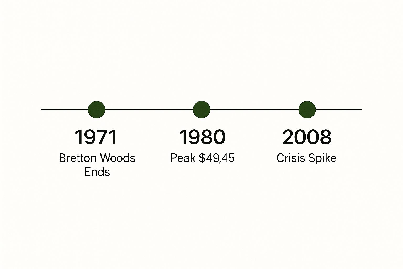
You can see how events like the end of the Bretton Woods system, which severed the direct link between the US dollar and gold, preceded huge price spikes. It's a clear reminder of how major policy changes can directly move the needle on precious metals.
The Great Silver Spike of 1979-1980
Against this backdrop of fear and uncertainty, a new and powerful force entered the scene: intense speculation. This era is legendary for the Hunt brothers' attempt to corner the entire world's silver market. They were convinced that runaway inflation and a finite supply of physical silver would send the price to the moon, so they started buying up massive, massive amounts of the metal.
Their buying spree added rocket fuel to an already lit fire. As they vacuumed up more and more silver, the price didn't just climb—it launched. This created a feedback loop: the rising price pulled in more speculators, which only pushed the price higher. The market morphed from an inflation hedge into a full-blown speculative mania.
The numbers from this time are just jaw-dropping. After bumping along below $10 per ounce for most of the '70s, the price exploded, screaming past $36 per ounce by late 1979 and into early 1980. That's a mind-boggling increase of over 260% in just a few short years.
This single event teaches us a core truth about the silver market: while fundamental factors like inflation can set the stage, it's often investor psychology and speculative fever that dictate how high the peak really goes.
The Inevitable Collapse and Aftermath
Of course, what goes up that fast usually comes down just as hard. The sky-high price of silver couldn't last. In response to the blatant market manipulation and chaos, regulators and exchanges finally stepped in. They changed the trading rules, making it incredibly difficult for speculators to hold onto their highly leveraged bets.
That was the pin that popped the bubble. The Hunt brothers couldn't meet their margin calls and were forced to sell. Their selling triggered a tidal wave of panic across the market, and the price of silver collapsed just as spectacularly as it had risen. The event went down in history as "Silver Thursday."
After the crash, silver went into a long hibernation. For most of the 1980s and 1990s, the price was stuck in the doldrums, often trading well below $10 an ounce. The speculative frenzy had badly burned a lot of people, and it took decades for the market to truly find its footing again.
This whole boom-and-bust cycle offers some critical lessons:
- Economic Conditions Matter: High inflation and a weak dollar created the fertile ground for silver's initial takeoff.
- Sentiment is a Multiplier: Speculative excitement can dramatically amplify underlying trends, for better or for worse.
- Volatility is a Two-Way Street: Silver's ability to produce rapid gains is matched only by its potential for brutal corrections.
This dramatic piece of history provides essential context for anyone looking at a silver price chart today. It perfectly illustrates how the metal's value is forged in the complex interplay between economic reality and market psychology. Understanding these key factors influencing gold and silver prices is the first step to truly interpreting its movements.
Modern Highs and Lows in the Silver Market
The 21st century kicked off a wild new chapter for silver. It’s a story of a breathtaking climb to a modern peak, a brutal correction, and a long, slow rebuild. This recent history, which you can see play out on any historical price of silver graph, gives us a front-row seat to how silver acts in our deeply connected financial world. The most telling part of this story was the rocket-like surge to its all-time high in 2011, a direct result of one of the biggest economic earthquakes in modern memory.
It all started with the 2008 Global Financial Crisis. When major banks started to wobble and looked like they might collapse, global markets went into a nosedive. A massive wave of fear washed over investors. Suddenly, faith in the traditional financial system was shattered. People were desperate to find safety in tangible, physical assets—things they could hold in their hand, far away from the chaos of stocks and complex derivatives.
In a mad dash to stop the bleeding, central banks everywhere, with the U.S. Federal Reserve leading the charge, rolled out monetary policies on a scale never seen before. The big one was Quantitative Easing (QE), a fancy term for printing staggering amounts of new money to buy up government bonds. While the goal was to stabilize the economy, it had a side effect: it watered down the value of currencies and lit a fire under inflation fears.
The Climb to an All-Time High
This environment was the perfect storm for precious metals. As investors watched the value of their paper portfolios get eaten away, they ran for the time-tested safety of physical silver and gold. This wasn't just about chasing profits; it was a fundamental flight to wealth preservation. People wanted something real.
This flood of investment demand sent silver on an unbelievable three-year bull run. The price action between 2008 and 2011 was absolutely stunning. Silver vaulted from under $10 per ounce in late 2008 to a historic peak, proving just how explosive it can be when fear takes over the market.
The modern all-time high for silver hit $49.51 per ounce in April 2011. That number is still a massive psychological benchmark for the market today. This peak wasn't driven by factories needing more silver, but almost entirely by a tidal wave of investment demand during a time of pure economic panic.
This historic run is a perfect example of silver's dual personality. Its industrial use gives it a solid price floor, but its role as a safe-haven asset gives it the power to go meteoric during a crisis.
To put these dramatic price shifts into perspective, here’s a quick look at some key moments in silver's recent history and what was happening in the world to drive them.
Milestone Silver Prices in Modern History
| Event / Period | Approximate Price Per Ounce (USD) | Key Driving Factors |
|---|---|---|
| Late 2008 | Under $10 | The initial shock of the Global Financial Crisis created extreme fear and a dash for cash, temporarily depressing asset prices. |
| April 2011 | $49.51 (All-Time High) | Unprecedented investment demand fueled by fears of currency devaluation from Quantitative Easing (QE) and a loss of faith in the financial system. |
| 2013-2020 | $14 - $20 Range | A long period of market consolidation and price correction after the 2011 speculative bubble burst and economic panic subsided. |
As the table shows, silver's price isn't just a random number; it's a direct reflection of global economic health and investor confidence.
The Correction and Subsequent Consolidation
Just like the peak in 1980, the 2011 high was followed by a sharp and painful correction. As soon as the immediate economic panic started to fade and markets found their footing, a lot of the "hot money" that had poured into silver started to pour back out. The price fell hard from its highs, kicking off a bear market that would last for years.
This aftermath is just as crucial to understand as the run-up. It shows us how volatile silver can be and serves as a reminder that prices driven purely by fear can fall just as fast when that fear goes away. From 2013 to 2020, silver traded in a much lower and more stable range, mostly between $14 and $20 per ounce. This was a consolidation phase, where the market was trying to find its new normal after the speculative fever broke.
This entire modern cycle—the crisis-fueled surge, the dramatic peak, and the long correction—is an invaluable lesson. The historical price of silver graph from this era clearly shows a long-term upward trend that gets punctuated by massive, event-driven volatility. Getting a handle on the bullish case for silver and what it means for investors can help you make sense of these movements.
When you zoom out and look at the very long term, the story is clear: silver's major price swings are tied to big economic events. History shows its price responds to war, inflation, and financial instability, reaffirming that its role as a core financial asset is as relevant today as it has ever been.
How to Begin Acquiring Physical Silver
After digging into the fascinating, and sometimes wild, history of silver's price movements, you might be asking yourself, "Okay, so how do I actually buy some?" It's a great question. Moving from studying charts to holding a tangible asset in your hand is a big step, but it’s far less complicated than you might think.
The journey starts with a simple decision: what form of silver makes the most sense for you? Think of it like buying a car. You wouldn't buy a sports car to haul lumber, and you wouldn't buy a pickup truck for a racetrack. Silver is similar—different forms serve different purposes. The three main types you'll come across are government-minted coins, privately minted rounds, and silver bars.
Coins, Rounds, and Bars Explained
Getting a handle on the differences between these three is the key to buying with confidence. While they're all made of pure silver, they differ in their recognizability, cost, and best use case.
- Government-Minted Coins: These are the big names, like the American Silver Eagle or the Canadian Silver Maple Leaf. Produced by sovereign governments, they are official legal tender (though the face value is mostly symbolic). Their biggest advantage is instant recognition and trust worldwide, which makes them incredibly easy to buy and sell.
- Silver Rounds: These look and feel like coins but are made by private mints. They have no face value and aren't legal tender, but they are an absolutely fantastic way to stack pure silver. 1 oz Silver Rounds are a go-to for many because their premiums (the cost over the silver's raw value) are often lower than government coins.
- Silver Bars: If your goal is to get the most silver for your money, bars are your best friend. They come in all sizes, from small 1-ounce bars to much larger bricks, and they almost always have the lowest cost per ounce. A 10 oz Silver Bar, for example, is a very efficient way to add serious weight to your holdings.
Your choice really boils down to what you prioritize—global recognition, the lowest possible cost, or something in between.
No matter which you choose, the most important shared trait is purity. Investment-grade silver is typically .999 fine or even higher. That means it's 99.9% pure silver, ensuring you're getting a high-quality, tangible asset that will hold its value.
Understanding Premiums and Spot Price
When you go to buy any physical silver product, you'll see its price is higher than the "spot price" you see on market charts. That extra cost is called the premium. It's not a hidden fee; it's a necessary part of the process that covers minting, manufacturing, shipping, and a small dealer profit.
A good analogy is buying a bottle of water. The water itself is practically free, but you're paying for the plastic bottle, the purification process, the label, and getting it to your local store. The premium on a silver coin is the same idea—it's the cost to turn raw silver into a beautiful, verifiable, and tradable product you can actually hold.
Generally, bars have lower premiums than coins, and bigger bars have lower premiums per ounce than smaller ones. This is just an economy of scale at play. It costs less per ounce to make one 10-ounce bar than it does to make ten 1-ounce bars. Knowing this can help you strategize to get the most metal for your money. For a deeper dive into these concepts, check out our guide on how to invest in precious metals as a safe haven.
Common Questions About Silver Price History
Looking at silver's price history can sometimes feel like opening a can of worms—it often raises more questions than it answers. The metal has a complex personality, acting as both an industrial workhorse and a financial shield, which leads to some really important questions. Let's tackle some of the most common ones to help you connect the dots.
Think of this as putting the final pieces of the puzzle together. Once we get these questions answered, you'll have a much clearer picture of silver's history, how it relates to other assets, and what its future might hold.
Why Is Silver More Volatile Than Gold?
One of the first things you'll notice when comparing silver and gold charts is how much wilder silver's price swings can be. It's not your imagination. There are two big reasons for this, and they both come down to how its market is built.
First off, the silver market is just plain smaller than the gold market. A lot smaller.
Imagine the gold market is a massive, deep lake. If you toss a big rock into it (representing a huge buy or sell order), you'll make some ripples, but the lake's overall level won't budge much. Now, picture the silver market as a small pond. That same rock will create a huge splash, sending the water level surging or dropping in a major way.
That's precisely what happens with silver. Because its market has less total money flowing through it, large trades have a much bigger impact on its price, leading to those dramatic percentage swings.
Second, as we’ve seen, silver is playing two different games at once. Its price gets pulled in two directions: demand from investors looking for a safe haven and demand from industries that need it for manufacturing. Gold, on the other hand, is almost purely an investment or jewelry asset. This dual-demand for silver means its price has to react to both investor mood swings and what’s happening in the global economy, adding more variables that can cause bigger and more frequent price moves.
Silver's volatility is a direct result of its smaller market size and its dual identity. This characteristic can lead to powerful upward moves, but it's a feature that requires a long-term perspective.
What Does the Gold-to-Silver Ratio Mean?
You’ll often hear seasoned precious metals buyers talking about the gold-to-silver ratio. It sounds technical, but it’s actually a simple and powerful tool. It just tells you how many ounces of silver it takes to buy one ounce of gold at today's prices. For example, if the ratio is 80:1, you'd need 80 ounces of silver to trade for a single ounce of gold.
This ratio is a favorite among investors for gauging the relative value between the two main precious metals. It's always in flux, changing with their prices.
- A High Ratio (e.g., 90:1): When the ratio is historically high, it suggests that silver is undervalued, or "cheap," compared to gold. Some investors see this as a sign that silver might be ready to outperform gold.
- A Low Ratio (e.g., 40:1): When the ratio is historically low, it suggests silver is overvalued, or "expensive," relative to gold.
By keeping an eye on this ratio, you get a sense of how silver is doing not just in dollar terms, but against its closest monetary cousin. It adds crucial context that can help frame your buying decisions. For more on this, our article exploring if it really makes sense to invest in silver digs much deeper.
How Does Seasonality Affect Silver Prices?
Just like crops or retail sales, silver sometimes shows seasonal patterns—tendencies to do better or worse during certain times of the year. While nothing is ever a guarantee in the markets, looking at data over many decades reveals some interesting trends.
Historically, the first quarter of the year, especially January through March, has often been a strong season for silver. We sometimes see a dip around June, followed by another period of strength in the late summer and early fall. For instance, data from the last 52 years shows that March and September have frequently been peak months, while June often marks a low point.
But here’s a critical point: these are just historical tendencies, not gospel. Things can and do change. For example, between 2020 and 2024, April and October emerged as powerhouse months. In fact, 100% of Octobers in that four-year span closed with a positive gain.
This just goes to show that while seasonality can be a helpful guide, you should always weigh it against what’s happening in the economy and the overall market sentiment right now.
At Summit Metals, we believe that understanding the ins and outs of the silver market is the first step toward making confident decisions. Whether you're drawn to the history of American Silver Eagles or the pure value of silver bars, our collection is curated to meet the needs of every kind of investor. Explore our selection of high-quality gold and silver products today.